
Could you review this essay for me ?
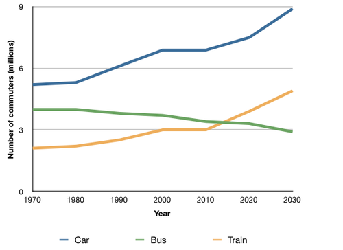
The graph below shows the average number of UK commuters traveling each day by car, bus or train between 1970 and 2030.
Write a report for a university, lecturer describing the information shown below.
Summarise the information by selecting and reporting the main features and make comparisons where relevant.
The line graph reveals the number of workers traveling to work by various transportation such as cars, buses, and trains in the UK from 1970 to 2030.
Overall, the trend of cars and trains is upwards while that of buses is forecasted to decline. Moreover, cars are the most popular form of transportation for British commuters for over 60 years.
To be specific, the number of people using cars gradually increased from 1970 to 1980 and is predicted to account for the highest number of people in 2030, which will be approximately 9 million people each day. From 1970 to 2010, people preferred buses to trains but from then there was a significant change in the number of commuters using these kinds of traveling methods when the number of train users increased and surpassed that of buses. Another striking feature is that 3 million people travel by trains in 2010 and this method of traveling is believed to increase more in the future to 5 million people in 2030, which will be similar to the beginning number of people who use cars in 1970.
Top answer
The line graph reveals (wrong verb) the numbers of workers traveling to work by various (Various is grammatical but it does not describe the graph at all. There are exactly three , aren't there? There are not any more or less.
- The line graph reveals (wrong verb) the numbers of workers traveling to work by various (Various is grammatical but it does not describe the graph at all.
- There are exactly three , aren't there?
- There are not any more or less.
- ) three means of transportation, such as cars, buses, and trains ( Such as means an example.
- It means that the list is incomplete.
Get the Weekly English Kit 📬
New words, one handy idiom, and a 2-minute quiz — delivered to your inbox to keep your streak alive.
The line graph reveals (wrong verb) the numbers of workers traveling to work by various (Various is grammatical but it does not describe the graph at all. There are exactly three, aren't there? There are not any more or less. ) three means of transportation, such as cars, buses, and train
 Related Questions