
Could you review this essay for me ?
The graph below shows US consumers' average annual expenditures on cell phone and residential phone services between 2001 and 2010.
Summarise the information by selecting and reporting the main features and make comparisons where relevant.
Write at least 150 words.
The graph gives the average amount of money spending on the cell phone and residential phone services from 2001 to 2010. The average annual expenditures had several statistics, began with 200$ and ended up with 800$.
Overall, the trend of cell phone services was upward trend while residential phone services were the downward trend. Moreover, there was a surpass point between these categories in 2006, and from then cellphone services passed over residential phone services in the cost of itself.
In detail, there was a huge gap between cellphone and residential phone in 2001 when residential phone services accounted for nearly 700$ and cellphone services made up 200$, which was two sevenths in total. Furthermore, both of these two services reached similar annual expenditures in 2006, which was 500$ and also became the surpass point when cellphone replaced residential phone services in general. By the end, in 2010, cellphones reached their peak of 750$, which was even higher than the beginning of residential phone services in 2001 for 50$.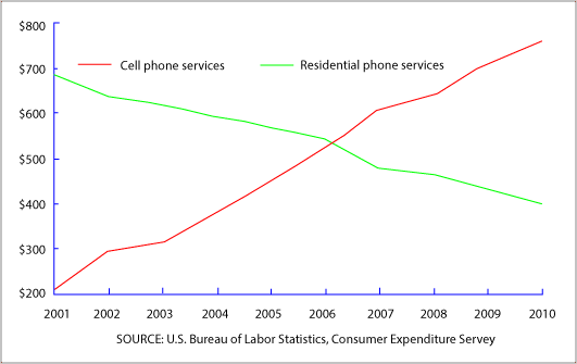
Top answer
The graph gives the average amount of money spent annually spending on the cell phone and residential phone services from 2001 to 2010 in the United States . The average annual expenditures had several statistics, began with 200$ and ended up with 800 $. ("several statistics" does not make sense.
- The graph gives the average amount of money spent annually spending on the cell phone and residential phone services from 2001 to 2010 in the United States .
- The average annual expenditures had several statistics, began with 200$ and ended up with 800 $.
- ("several statistics" does not make sense.
- Statistics is a school subject.
- You can take a course in statistics.
Get the Weekly English Kit 📬
New words, one handy idiom, and a 2-minute quiz — delivered to your inbox to keep your streak alive.
The graph gives the average amount of money spent annually spending on the cell phone and residential phone services from 2001 to 2010 in the United States. The average annual expenditures had several statistics, began with 200$ and ended up with 800$. ("several statistics"
 Related Questions