
Could you review my Writing Task 1?
The bar charts below give information on road transport in a number of European countries.
Summarise the information by selecting and reporting the main features, and make comparisons where relevant.
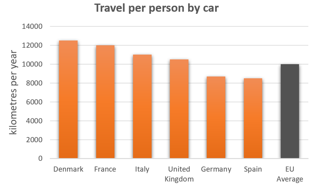
The bar chart delineates how much distance traveled by each individual in major European countries.
Regarding Germany and Spain, citizens of the latter by far traveled the lowest by car among Europeans, with an annual amount of about 8150 kilometers per person. Although an average Germanian traveling by car slightly exceeds that of Spain, with an amount of roughly 8320 kilometers per anum, the number still outpaced by most of the European nations.
By contrast, traveling distance by car per person on a yearly basis of UK and Italy registered around 11500 and 15000, respectively. By comparison, while the figure of France reached around 10000, Denmark became the nation with the highest number of kilometers (about 12100) of individual travel using car.
In conclusion, figures of the majority of nations were superior to that of EU Average with Denmark coming out on top.
Top answer
Please read my advice for Task 1 essays: IELTS TASK 1: Hints, Tips And Advice Vocabulary Words For Task 1: Reference Post You did not get the proper graphics for this essay. There are two missing bar charts. org/IELTS/academic_writing_samples_task_1/1141/
- Please read my advice for Task 1 essays: IELTS TASK 1: Hints, Tips And Advice Vocabulary Words For Task 1: Reference Post You did not get the proper graphics for this essay.
- There are two missing bar charts.
- org/IELTS/academic_writing_samples_task_1/1141/
Get the Weekly English Kit 📬
New words, one handy idiom, and a 2-minute quiz — delivered to your inbox to keep your streak alive.
Your essay is very repetitive, and that is because you have the wrong graphic for this topic. I have highlighted the areas of text with poor English.
The bar chart delineates (poor word choice) how much distance traveled by each individual in major European countries.
(ungra
 Related Questions