
Could you please help me with this Line Graph
The graph below shows the consumption of Fish and some different kinds of meat in a European country between 1979 and 2004.
Summarise the information by selecting and reporting the main features, and make comparisons where relevant.
The line graph illustrates data of an European country's demand in fish and varied kinds of meat in the period from 1979 to 2004.
Totally, all figures experienced downwarding in the amount of fish, beef, and lamb consumed, except for chicken.
In 1979, the number of the comsumption of beef started to decrease from 210 to 125 in the short time before reaching a peak of 240 in 1984 and then countinued to fluctuate on declining trend, finally catched the number 100 in 2004.
Although chicken and lamb had a similar number of need in 1979, around 150, there was an opposite moverment between two kinds of meat. While chicken kept rising through the years, the amount lamb kept falling until 2004 and dropped in 60 when chicken reach the number 250.
Despite slightly declining through the period, there was not a big change in fish demand, concretely at 60 and finish at 40 in the end of the period.
160 words.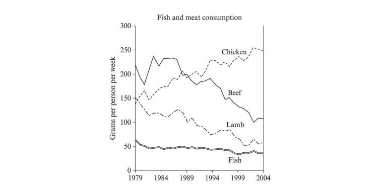
Top answer
The highlighted words are incorrect, mostly wrong vocabulary, but also spelling, missing words ( articles or prepositions) and grammatical errors. The word "demand" does not describe what is shown on the graph. Demand is what they desired; consumption is what they ate.
- The highlighted words are incorrect, mostly wrong vocabulary, but also spelling, missing words ( articles or prepositions) and grammatical errors.
- The word "demand" does not describe what is shown on the graph.
- Demand is what they desired; consumption is what they ate.
- If a food is in high demand, it will have a high price.
- Avoid the word "figure" in Task 1.
Get the Weekly English Kit 📬
New words, one handy idiom, and a 2-minute quiz — delivered to your inbox to keep your streak alive.
The highlighted words are incorrect, mostly wrong vocabulary, but also spelling, missing words ( articles or prepositions) and grammatical errors.
The word "demand" does not describe what is shown on the graph. Demand is what they desired; consumption is what they ate. If a food is in high demand, it will have a high price.
Avoid the word "figure" in Task 1. I
I just started learning IELTS by myself and still have many mistakes, but your help is really detailed and gives me motivation, thank you so much for your help!
 Related Questions