
Could you please help me to correct my ielts writing task 1?
Task 1: The graph and table below give information about water use worldwide and water consumption in two different countries. Summarize the information by selecting and reporting the main features, and make comparisons where relevant.
My writing:
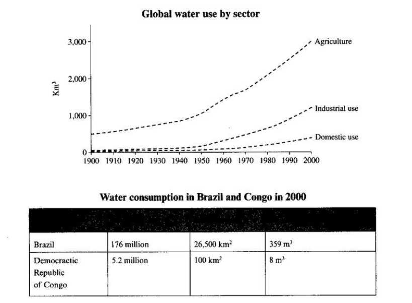
The given line chart and table demonstrate the water consumption by different sectors and the comparison of the amount of water used in two different countries, respectively.
According to the graph, starting from about 500 km3 in 1900, the water consumption of the agriculture area rose significantly to approximately 3000 km3 in 2000, and that sector had the highest water consumption compared to others. Following the agriculture use, the industrial use increased gradually nearly 1000 km3 throughout 100 years. Regarding domestic area, the water used by this sector increased slightly to just under 500 km3 during the span between 1900 and 2000.
As for the information reported in the table, the Brazil’s population was higher than that of the Congo 34 times. Moreover, the water consumption of Brazil was 359 m3, 45 times higher compared to that of the Congo which was only 8 m3.
Overall, the line chart showed that the agriculture use played key role in the water consumption worldwide from 1900 to 2000. Besides, the table stated that the Brazil’s water consumption was higher than that of the Congo in 2000.
(Total: 184 words)
Thank you so much 
Top answer
The given line chart (There are bar charts and pie charts. This is not a chart. ) different sectors (which ones?
- The given line chart (There are bar charts and pie charts.
- This is not a chart.
- ) different sectors (which ones?
- ) and the comparison of the amount of water used in two different countries (which ones?
- ) , respectively.
Get the Weekly English Kit 📬
New words, one handy idiom, and a 2-minute quiz — delivered to your inbox to keep your streak alive.
The given line chart (There are bar charts and pie charts. This is not a chart. ) and table demonstrate (not the best word) the water consumption by ( How many?) different sectors (which ones? When?) and the comparison of the amount of water used in two different countries (which ones? When?) , respective
 Related Questions