
Could you help me with my writing task 1? Thank you.
You should spend about 20 minutes on this task.
The graph below compares changes in the birth rates of China and the USA between 1920 and 2000.
Summarise the information by selecting and reporting the main features, and make comparisons where relevant. Write at least 150 words.
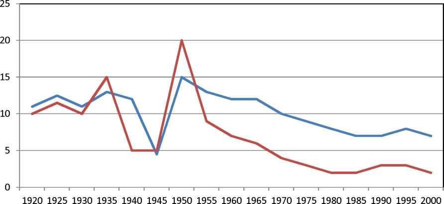
The line graph plots some striking facts of the USA and China’s birth rates from 1920 to 2000.
Overall, there were some similarities between these data, which was demonstrated by the downward trend after the 1950s and the fluctuation from 1920 to 1945.
At the first of the period, the birth rates of the USA and China were 10% and 12% respectively. Over the next 10 years, both data had the same wave between 10% and 14% until the percentage of the USA’s birth rates steadily decreased from 12% to 4% in 1945 while China’s birth rates dipped by 10% to 5% in 1940. Then, there was an exponential upsurge of the birth rates in China which reached a peak at 20% in 1950. Likewise, the proportion of the USA birth rates climaxed 15% at the same time. After the 1950s, these figures progressively went down to 7% for the USA and about 2% for China in 2000.
Top answer
The line graph plots some striking facts of (I don't see any "striking facts" plotted. There are numbers plotted. ) the USA and China’s birth rates in the USA and China from 1920 to 2000.
- The line graph plots some striking facts of (I don't see any "striking facts" plotted.
- There are numbers plotted.
- ) the USA and China’s birth rates in the USA and China from 1920 to 2000.
- ) which was demonstrated by the downward trend after the 1950s and the fluctuation (wrong word.
- There is no pattern of fluctuation on this graph.
Get the Weekly English Kit 📬
New words, one handy idiom, and a 2-minute quiz — delivered to your inbox to keep your streak alive.
The line graph plots some striking facts of (I don't see any "striking facts" plotted. There are numbers plotted. ) the USA and China’s birth rates in the USA and China from 1920 to 2000.
Overall, there were some similarities between these data,( I think you mean this
 Related Questions