
Could you help me with my writing Ielts task 1, please? Thank you a lot.
You should spend about 20 minutes on this task.
The graph below shows the percentage of people going to cinemas in one European country on different days.
Summarize the information by selecting and reporting the main features and make comparisons where relevant.
You should write at least 150 words.
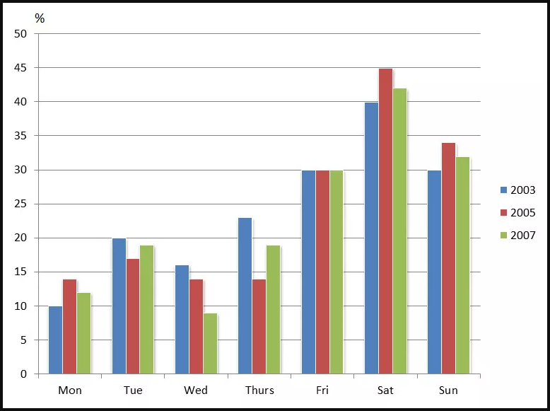
The bar chart shows the proportion of individuals living in a European nation go to movie theatres on dissimilar days of the week, in 2003, 2005 and 2007.
Overall, it can be easily seen from the graph that people had a tendency to watch films mostly on weekends. In addition, Saturday was the most favoured day for movie watchers, while the participant rate of movie goers on Monday was the lowest.
From Monday to Thursday, less than a fifth of the population in 3 different years went to the cinema for the movie, however, Tuesday’s percentage was remarkably the highest of the other 3 days when reaching at 20% in 2003, 17% in 2005 and nearly 19% in the last year. Interestingly, the number of movie watchers on Wednesday decreased roughly from 16% in the first year to the lowest at about 9% in 2007.
As for the remaining three days, based on the analysis of inhabitants’ percentage, on Saturday, there were 40% people going to the cinema in 2003, turning to the next two year, this figure rose up when reaching the peak of 40% and finally decreased by 3% in the year of 2007. Meanwhile, Friday seemed to stably stand at the exactly same percentage – only 30%. During the given period, Sunday showed that its data began at 30% in the first year, increasing to 34% then dropped to 32%.
Get the Weekly English Kit 📬
New words, one handy idiom, and a 2-minute quiz — delivered to your inbox to keep your streak alive.
 Related Questions