
Could you help me with my writing Ielts task 1, please? Thank you a lot.
The pie charts below show the average household expenditures in Japan and Malaysia in the year 2010. Summarise the information by selecting and reporting the main features, and make comparisons where relevant.
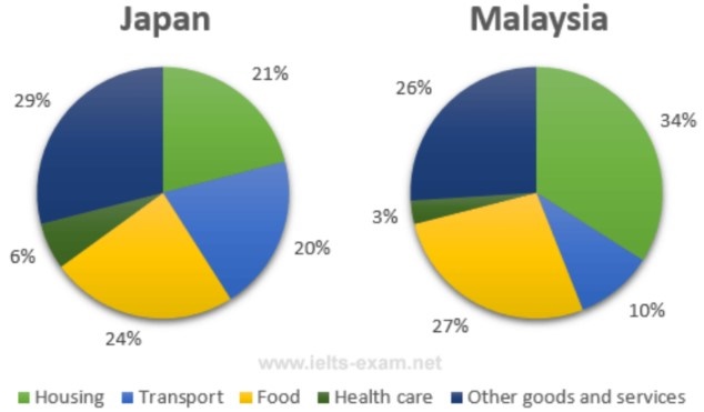
The pie chart gives information about the average household expenditure on five different categories in Japan and Malaysia in 2010.
Overall, it can be seen that both Malaysian and Japanese spent most of their expenditure on housing, food and other goods, services. The proportion of healthcare was the lowest in 2 countries.
The percentage of expenditure on housing in Japan was 21%, less than in Malaysia was 34%. It can be seen that Japanese just spent 24% of their expenditure on food but Malaysian spent more than a quarter of their expenditure, 27%. Most of Japanese households spent on other goods and services, about 29% of their expenditure. This was higher than Malaysian households, who spent just 26% of their total spending.
According to the chart, the proportion of spending on transport of Japanese households was 20%, which was twice times as much as Malaysian. The smallest of both Japanese and Malaysian households expenditure was on healthcare, which was only 6% and 3%
Get the Weekly English Kit 📬
New words, one handy idiom, and a 2-minute quiz — delivered to your inbox to keep your streak alive.
 Related Questions