
Could you help me with ielts writing task 1?
Task 1: The bar chart shows the percentage of small , medium, large companies which used social media for business purposes between 2012 to 2016.
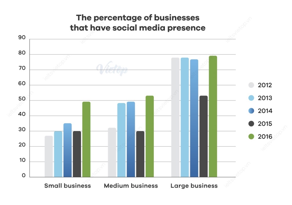
Given is a column graph comparing the percentage of three different types of companies having a presence on social media over a four years period between 2012 and 2016.
Looking first as the whole, the percentage of businesses using social media went up over the whole period regardless of their size. Also, although the figure of large companies increased the least, it was still by far the greatest social media presence each year.
With respect to minor and medium businesses, in the first three years, the figure rose gradually to about 35% and 49% respectively. After that, both small and medium companies experienced a mild setback in 2015 to 30%. In the last year of the period, the percentage of these two types of businesses recovered to around 50%.
In contrast, the percentage of large companies was more than double small and medium businesses in the first year of the period at 78%. After that, this figure remained stable until 2015, after surging to 52%, preceding a recovery to less than 80% at the end of the period.
Thanks a lot!
Top answer
Please post essays, paragraphs, dialogues and other writing in the essay forum so a moderator does not have to move your post. Click on this link: Next, tap on the green button "write a new post"
- Please post essays, paragraphs, dialogues and other writing in the essay forum so a moderator does not have to move your post.
- Click on this link: Next, tap on the green button "write a new post"
Get the Weekly English Kit 📬
New words, one handy idiom, and a 2-minute quiz — delivered to your inbox to keep your streak alive.
Given (That is not good.) is a column graph (I have never seen this described as a column graph. Use standard names for these kinds of common plots. Read my advice. ) comparing the percentage of three different types (what types of companies are they? - Retail stores? Used car lots? E
 Related Questions