
Could You Give Some Comments On My IELTS Writing Task 1?
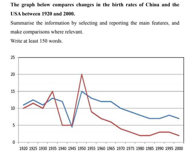
The line graph compares changes within the birth rates of China and the USA in the range of 1920 and 2000. Overall, there was a general decrease in percentage of birth in both nations throughout the time surveyed. However, the USA's birth rates almost was higher than that of China over the whole period. In 1920, the China and the USA had similar birth rate of fertility about 10% to 12%. Later, the proportion of China rose higher than the US and reach to 15%, but for the next 5 years, both nations plummet down to a low of 5%. Move on to 1950, it can be seen that the USA and China all increased to exactly 15% for the former and 20% for the latter. Nevertheless, in over 30 period years, the rates of fertility in China and the USA had significant reduction by 8% and 13% respectively. In 2000, it made a steady fall to the final figure of around 3% for China and around 7% for the USA.
Top answer
One main problem with your essay is that you did not divide your text into separate paragraphs. You will lose a lot of points on "coherence and cohesion". The yellow highlighted text denotes some mistake: incorrect wording, incorrect form, incorrect value, spelling error or unnatural phrasing.
- One main problem with your essay is that you did not divide your text into separate paragraphs.
- You will lose a lot of points on "coherence and cohesion".
- The yellow highlighted text denotes some mistake: incorrect wording, incorrect form, incorrect value, spelling error or unnatural phrasing.
- These need to be revised to the appropriate words and phrases.
- As you can see, the proportion of incorrect text to correct text is quite significant.
Get the Weekly English Kit 📬
New words, one handy idiom, and a 2-minute quiz — delivered to your inbox to keep your streak alive.
One main problem with your essay is that you did not divide your text into separate paragraphs.
You will lose a lot of points on "coherence and cohesion".
The yellow highlighted text denotes some mistake: incorrect wording, incorrect form, incorrect value, spelling error or unnatural phrasing. These need to be revised to the appropriate words and phrases.
As you can see, the
 Related Questions