
Can you review the task 1 ? Thank you !
The pie charts compare the cost distributing for housing, food, health care, education, transportation and other demand of the household in a nation in 1950 and 2010.
In 1950, the household spent a largest paying of the total expenditures for housing, up to 72.1%, food was secondary of these lists with 11.2%, education, transportation, health care and other paying were 6.6%, 3.3%, 2.4% and 4.4% respectively.
In 2010, the cost of housing decreased three or more times, down to 22.0%. In contrast while, the paying for food increased three or more times, up to 34.0%, for transportation and other demand went up more than four times, up to 14.0%, for health care rose more than two times, up to 4.5%, only education expense slightly down to 6.3%.
After 60 years from 1950, people in this nation changed their expenditure habit that they did not spend too much money for housing, instead, they distributed expense to other major demand much more.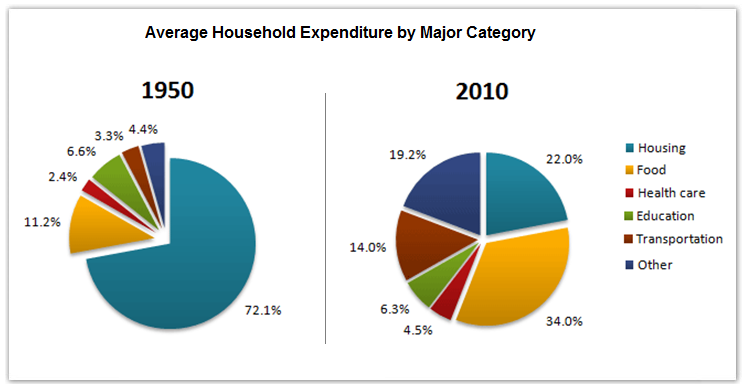
Top answer
Your essay contains too many grammar mistakes, which can reduce your score considerably. You should work on the grammar more.
- Your essay contains too many grammar mistakes, which can reduce your score considerably.
- You should work on the grammar more.
Get the Weekly English Kit 📬
New words, one handy idiom, and a 2-minute quiz — delivered to your inbox to keep your streak alive.
Your essay contains too many grammar mistakes, which can reduce your score considerably.
You should work on the grammar more.
You did not include the instructions.
The pie charts show the average household expenditures in a country in 1950 and 2010.
Summarize the information by selecting and reporting the main features and make comparisons where relevant.
The pie charts compare the
 Related Questions