
Can you please give me some feedback on my Writing Task 1?
The chart below shows the percentage of Australian people who were born in different places of the world.
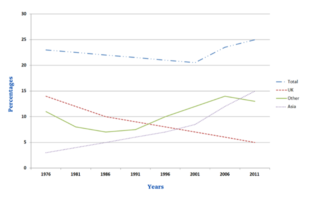
The line graph compares the proportion of Australians born in different parts of the world (UK, Asia, and Other) between 1976 and 2011.
Overall, more and more babies were born in Asia and other places, with the former showing the fastest growth, while giving birth in the UK gradually became uncommon for the Australian people. In addition, a steady fall was seen in the total population for the first 25 years, which rose sharply in the last 10 years.
In 1976, the UK recorded the highest percentage of nearly 14% Australians born, followed by other countries (11%), and finally Asia at only 3%. Over the first half of the period, Australian people born in Asia went up by half to about 7%, whilst decreases occurred in that of the UK and other countries, both going down to roughly 8%. Meanwhile, for the proportion in total, it dropped marginally by 3%, from around 23% to just over 20%.
For the rest of the time span, Australian birth in the UK continued its declining trajectory, finishing at merely 5%. By contrast, there was a significant growth of 5% in the total population, owing to almost double increases in the Australians born in the Asia and other places. In 2011, Asia became the place with highest percentage of Australian birth (15%), surpassing Other by a negligible amount.
Top answer
Can you please reply me? Thanks!
- Can you please reply me?
- Thanks!
Get the Weekly English Kit 📬
New words, one handy idiom, and a 2-minute quiz — delivered to your inbox to keep your streak alive.
 Related Questions