
Can you please give me some feedback on my Writing Task 1.
The line graph illustrates the proportion of total expenditure in a certain European country between 1960 and 2000.
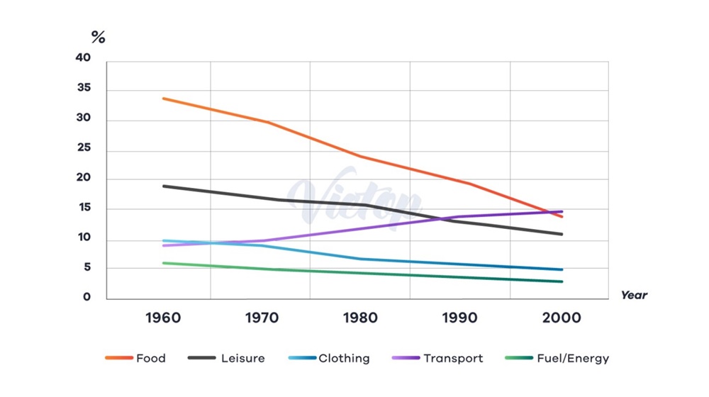
The line graph compares the percentage of total spending on five categories, namely food, leisure, clothing, transport and fuel/energy in a certain European nation over the period of four decades starting from 1960.
Overall, allocations for food, leisure, clothing and fuel/energy showed a downward trend over the period, while for transport, it rose significantly. At the beginning of the time frame, food expenses registered the highest proportion; however, being replaced by transport in the final year.
In detail, more than one-third of total expenditure was diverted to food in 1960, almost doubling that of leisure and quadrupling that of transport. Food and leisure expenses followed a similar trajectory over the whole course, declining progressively and finishing at roughly 14% and 11% in 2000. Likewise, there was a substantial increase in the spending on transport, which exceeded leisure’s percentage in 1990 and ultimately arrived at around 15% in 2000.
Regarding clothing and fuel/energy, their proportions stood at about 10% and 6% respectively in the first year. Both recorded a moderate fall, with clothing reduced by half and fuel/energy dropped by merely 3% in expenditure at the end of the timescale.
Top answer
The line graph compares the percentage of total spending on for five categories, namely food, leisure, clothing, transport and fuel/energy in a certain European nation over the period of four decades starting from 1960. Overall, allocations for food, leisure, clothing and fuel/energy showed a downward trend over the period, while for transport, it rose significantly. At the beginning of the time frame, food expenses registered had the highest proportion; however, being replaced (wrong verb form) by transport in the final year.
- The line graph compares the percentage of total spending on for five categories, namely food, leisure, clothing, transport and fuel/energy in a certain European nation over the period of four decades starting from 1960.
- Overall, allocations for food, leisure, clothing and fuel/energy showed a downward trend over the period, while for transport, it rose significantly.
- At the beginning of the time frame, food expenses registered had the highest proportion; however, being replaced (wrong verb form) by transport in the final year.
- In detail, more than one-third of total expenditure was devoted diverted to food in 1960, almost doubling (wrong verb form) that of leisure and quadrupling (wrong verb form) that of transport.
- Food and leisure expenses followed a similar trajectory over the whole course, declining continuously progressively and finishing at roughly 14% and 11% in 2000.
Get the Weekly English Kit 📬
New words, one handy idiom, and a 2-minute quiz — delivered to your inbox to keep your streak alive.
The line graph compares the percentage of total spending on for five categories, namely food, leisure, clothing, transport and fuel/energy in a certain European nation over the period of four decades starting from 1960.
Overall, allocations for food, leisure, clothing and fuel/energy showed a downward trend over the period, while for
Sample essay:
The highest scoring essays combine categories into larger groups in a logical way. They give the "big picture" rather than writing about minor insignificant details.
In this graph, the most notable feature is that the relative amounts that are devoted to these particular five budget categories went down from 75% to 50%.
Note that I do not waste
 Related Questions