
Can you please evaluate my Writing Task 1 - Book 10 Test 1 Writing Task 1
The first chart below shows how energy is used in an average Australian household. The second chart shows the greenhouse gas emissions which result from this energy use.
Summarise the information by selecting and reporting the main features, and make comparisons where relevant.
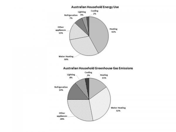
The first pie chart provides information about energy usage in an average Australian household. The following chart shows the greenhouse gas emissions which come from this energy use.
Energy is used mainly for house heating and water heating, with 42% and 30% respectively. Other devices which consume energy are working with electricity use rest of the amount with 15%. Refrigeration is following after other gadgets with 7%. However, the energy which is used for cooling and lighting is fairly less, with 2% and 4%.
The highest proportion of green gas emission in an average Australian house is water heating with almost a third. Other appliances consumption has 28% gas releasing. House heating and refrigeration have similar percentages of greenhouse gas emissions with 15%. However, the gas emissions which are by cooling and lighting have the lowest numbers with only 3% and 8% respectively.
Overall, it can be seen that in both charts, water heating has a significant impact for energy use and greenhouse gas emission.
(165 Words)
Can you please also give a band score because I am curious what band score this kind of writing can get?
Thanks in advance.
Top answer
Do not copy extra material from a website, just your writing. And be sure to write in English. This is a test of your ability to write in English.
- Do not copy extra material from a website, just your writing.
- And be sure to write in English.
- This is a test of your ability to write in English.
- You will not have access to a translation service in the exam room!
Get the Weekly English Kit 📬
New words, one handy idiom, and a 2-minute quiz — delivered to your inbox to keep your streak alive.
Do not copy extra material from a website, just your writing. And be sure to write in English. This is a test of your ability to write in English. You will not have access to a translation service in the exam room!
 Related Questions