
Can you help me with my writing task 1, please? Thank you very much.
You should spend about 20 minutes on this task.
The chart below gives information about the growth of the urban population in certain parts of the world including the prediction of the future. Summarise the information by selecting and reporting the main features and make comparisons where relevant.
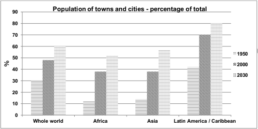
The bar chart illustrates the increasing urban population in the world, compared with 3 regions, Africa, Asia, and Latin America through 1950, 2000, and 2030.
Generally, there is an upward trend of the population in the urban areas globally.
Starting from 1950, the percentages of urban dwellers reached 30%, but it rose to approximately 48% of people living in the cities 50 years later, in 2000. Therefore, it is continuously predicted to achieve 60% in 2030. Besides, Latin America has the highest proportion of the city’s residents, which initially stood at about 40% in 1950 to significantly went up by 30% to 70% in 2000, with a further forecast to climb up to 80% in the next 30 years, 2030.
Likewise, the population trends in urban areas of Africa and Asia have some similarities. While 11% of the Africa population were urban dwellers in 1950, collated with the 12% in Asia figure, both of them increased to approximately 38% in 2000, and if the Africa chart is expected to be up to 51% in 2030, the population percentages in Asia is projected to slightly higher to be about 56% at the same year.
Get the Weekly English Kit 📬
New words, one handy idiom, and a 2-minute quiz — delivered to your inbox to keep your streak alive.
 Related Questions