
Can you help me T
The graph below compares the changes in the birth rates of China and the USA between 1920 and 2000.
Summarise the information by selecting and reporting the main features and make comparisons where relevant.
.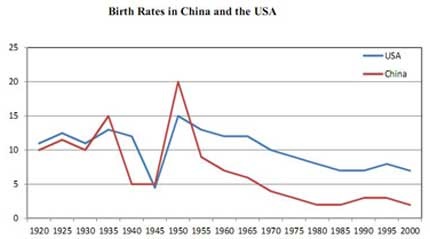
A galance at the graph provided the differences between the Chinese and the US birth rates during the period from 1920 to 2000.
Overall, It is obvious that both countries saw the considerable fluctuation with lows during the 1940s and highs during the 1950s.
In 1920, The fertility is fluctuated from 10 percent and came to 15 percent in 1935. Afterwards, The birth rate decreased sharply in the 1940s at 5 percent before It reached a peak with a rate is 20 percent. The latter half of century, However brought a steadily decline in this figure.
In the US, meanwhile, varied some where between 11 and 13 percent before increasing approximately 14 percent in 1935. Then, the birth rates not only decreased slightly to 13 percent but also fall dramatically at 4 percent in 1945. The following 5 years, there was a sharp increase to 15 percent. Finally, It went down gradually from 1950 to 2000.
Thanks for help me!
Top answer
A galance at the graph provided the differences between the Chinese and the US birth rates during the period from 1920 to 2000. (This is not a good first sentence. A glance is a very very quick look.
- A galance at the graph provided the differences between the Chinese and the US birth rates during the period from 1920 to 2000.
- (This is not a good first sentence.
- A glance is a very very quick look.
- " If you glance at a clock, you will know the time.
- but you cannot understand a graph by glancing at it.
Get the Weekly English Kit 📬
New words, one handy idiom, and a 2-minute quiz — delivered to your inbox to keep your streak alive.
A galance at the graph provided the differences between the Chinese and the US birth rates during the period from 1920 to 2000. (This is not a good first sentence. A glance is a very very quick look. It is not a good subject of "provided." If you glance at a clock, you will know the time. but you cannot understand a graph by glancing at it. A
 Related Questions