
Can you help me check this writting lesson. Thanks you!
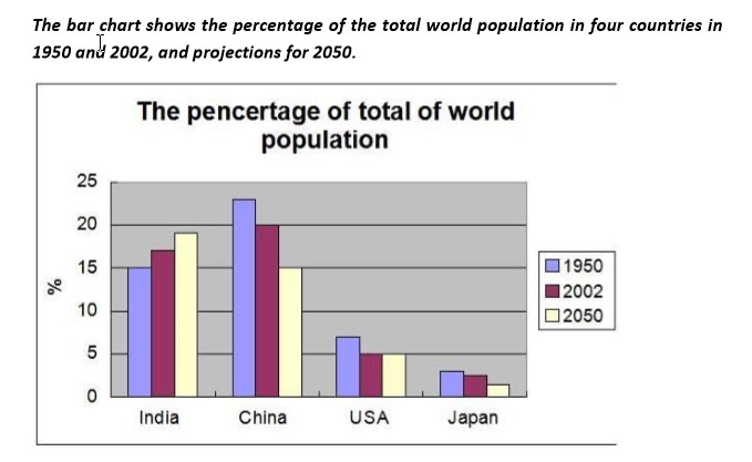
The bar chart compares the population of India, China, USA and Japan in three different years: 1950, 2002 and predictions for 2050. The percentage of the population in each country compared to the global populations is the data.
Overall, the populations of India and China are higher than the populations of the USA and Japan. Additionally, while the percentage of China, USA and Japan populations gradually decrease in three years, the percentage of India population tends to increase in each year.
The total populations of four countries get 48% in 1950, get 44% in 2002 and prediction get 41% in 2050 compared to the global populations. In 1950 and 2002, the population of China was higher than the populations of the other three countries by factors: 1.5 times, 3.3 times and 7.7 times in 1950; and 1.2 times, 4 times and 10 times in 2002 of India, USA and Japan, respectively. But, for 2050, the population of India is predicted the higher than the China, the USA and the Japan by factors: 1.3 times, 3.8 times and 9.5 times, respectively.
Top answer
Please post essays in the essay forum so we don't have to move it there. htm
- Please post essays in the essay forum so we don't have to move it there.
- htm
Get the Weekly English Kit 📬
New words, one handy idiom, and a 2-minute quiz — delivered to your inbox to keep your streak alive.
Please post essays in the essay forum so we don't have to move it there.
https://www.englishforums.com/English/EssayReportCompositionWriting/Forum9.htm
The bar chart compares the population of India, China, USA and Japan in three different years: 1950, 2002 and predictions for 2050. The percentage of the population in each country of compared to the global populations (wrong form. There is only one global population.) is
Hoàng Tr?n VanThe bar chart compares the population of India, China, USA
The chart only has USA written on it but, you should write the USA.
 Related Questions