
Can you help me check my writing for task 1 in the IELTS?
I'm sorry, but I can not find the task requirement.
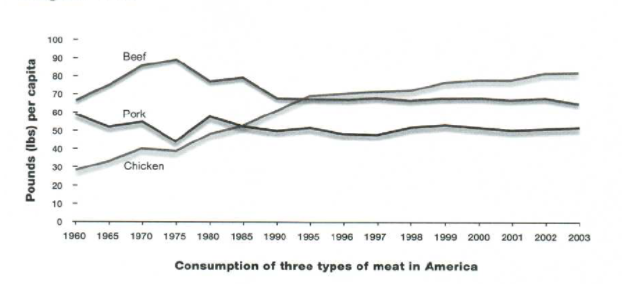
The line graph illustrates data on the changes of three different types of meat (beef, chicken, and pork) eaten by an average American from 1960 to 2003.
Overall, it is evident that the consumption of white meat saw the biggest growth over the given period. In addition, the figures for consumption of 2 types of red meat shared relatively similar patterns.
With regard to the amount of pork meat consumed in the United States in 1960, one person ate around 60 pounds, which was lower than that of beef (around 67 pounds). Over the following 30 years, both the amount of pigeon and cow meat used for foods experienced wild fluctuations, but they managed to recover to their beginning figures in 1960. After this time, there were no significant changes in the trends in consumption of 2 groups of red meat.
Just 30 pounds of chicken meat was consumed per person in 1960. However, that amount had doubled by 1990. It continued to rise gradually before reaching its peak at around 70 pounds per capita at the end of the time span.
Top answer
Please read my advice for Task 1 essays: IELTS TASK 1: Hints, Tips And Advice Vocabulary Words For Task 1: Reference Post
- Please read my advice for Task 1 essays: IELTS TASK 1: Hints, Tips And Advice Vocabulary Words For Task 1: Reference Post
Get the Weekly English Kit 📬
New words, one handy idiom, and a 2-minute quiz — delivered to your inbox to keep your streak alive.
The line graph illustrates data (wrong expression) on the changes (It plots the amounts, not the year-over-year changes. You need to be accurate in describing graphs.) of three different types of meat (beef, chicken, and pork) eaten annually
 Related Questions