
Can you give me some comments on my Writing Task 1.
TOPIC: The first graph shows the number of train passengers from 2000 to 2009; the second compares the percentage of trains running on time and target in the period.
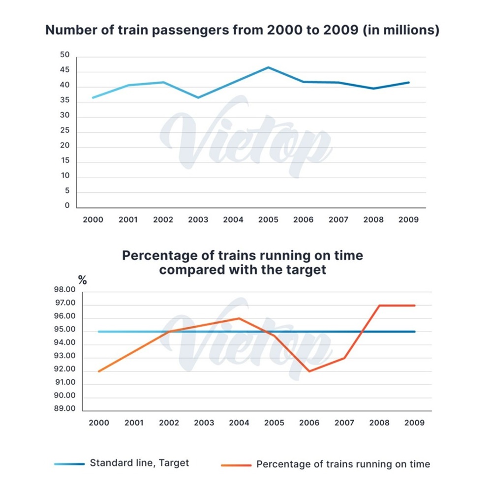
The first bar graph provides information about the number of people commuting by trains, while the second compares the proportion of on-time arrivals of trains with the goal over a decade starting in 2000.
Overall, both the quantity of rail travelers and the percentage of trains running on schedule showed considerable variations with an upward trajectory during the given time frame.
Standing at about 36,000 at the beginning of the period, the number of train passengers rose steadily by approximately 6,000 within 2 years, before falling progressively to the same level as that in 2000. This figure went up again during the next 3 years, but more sharply, to a peak of roughly 47,000 citizens in 2005, after which it declined moderately and ended the decade at nearly 42,000 in 2009.
With respect to the percentage trains arriving without delays, there was a substantial increase in the first half of the course, from exactly 92% to 96% in 2004, surpassing the standard line by 1%. This figure, which slumped markedly to 3% lower than the target of 95% on-time trains three years later, reached a high of 97% in 2008 and then leveled off in the final year.
Top answer
mytraa The first bar graph Here are some bar charts, sometimes called bar graphs. There are simple bar charts, stacked bar charts, grouped bar charts and time series bar charts. You did not upload any bar charts.
- mytraa The first bar graph Here are some bar charts, sometimes called bar graphs.
- There are simple bar charts, stacked bar charts, grouped bar charts and time series bar charts.
- You did not upload any bar charts.
Get the Weekly English Kit 📬
New words, one handy idiom, and a 2-minute quiz — delivered to your inbox to keep your streak alive.
mytraaprovides information about
That does not say very much. Information can be almost anything. It is not a good way to start.
What values, measures or numbers are on this plot?
mytraa showed considerable variations
Every interesting plot in the entire world will show changes. That is not a "main feature"
 Related Questions