
Can you check my IELTS Task 1 Report ?
Please check my work if you have time. Thank you so much.
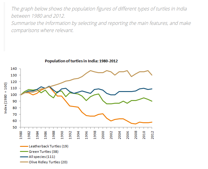
The line chart compares changes in the population of 3 types of turtles ( Leatherback Turtles, Green Turtles, and Olive Ridley Turtles) as well as all species combined in India between 1980 and 2012.
Overall, the population of Leatherback Turtles experienced an increase over a period of 32 years, while the index for two other species showed a decrease over the same period. In addition, the overall turtles population in India remained relatively stable over the period mentioned.
With regards to the population of Olive Ridley Turtles, it steadily increased by around 40% between 1980 and 1998 before fluctuating over the next 14 years and finishing at about 130% in the last year. On the other hand, the population for all the species combined remained relatively steady at around 100% from 1980 to 2012, with slight fluctuations.
In contrast, the index for the Green Turtles and the Leatherback Turtles experienced a downward trend between the two years. While there was a minimal decline in the population of Green Turtles, finishing at roughly 90% in 2012, the population for the Leatherback Turtles dramatically dropped to less than 60% over the same period.
Top answer
The line chart compares changes in the population of three 3 types of turtles ( Leatherback Turtles, Green Turtles, and Olive Ridley Turtles) as well as all species combined in India between 1980 and 2012. (That description is not quite right. It is not the actual population numbers at all, because all lines, even the combination of all the species, start at the same value (100) in 1980.
- The line chart compares changes in the population of three 3 types of turtles ( Leatherback Turtles, Green Turtles, and Olive Ridley Turtles) as well as all species combined in India between 1980 and 2012.
- (That description is not quite right.
- It is not the actual population numbers at all, because all lines, even the combination of all the species, start at the same value (100) in 1980.
- Try to write what this graph actually shows.
- You just need to add one word to do this.
Get the Weekly English Kit 📬
New words, one handy idiom, and a 2-minute quiz — delivered to your inbox to keep your streak alive.
The line chart compares changes in the population of three 3 types of turtles ( Leatherback Turtles, Green Turtles, and Olive Ridley Turtles) as well as all species combined in India between 1980 and 2012. (That description is not quite right. It is not the actual population numbers at all, because all lines, even the combination of
 Related Questions