
Can you check my essay, please?
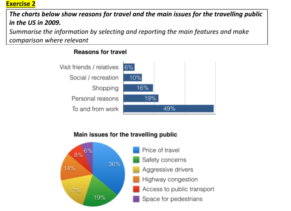
The bar chart shows travel’s purposes and the pie chart illustrates key consideration for the travelling public in the US in 2009.
Overall, principal reason for travel is to transport to and from work. Similarly, the price of travel is the key concern of people commuting by public transport.
Looking at the bar chart, going to work and coming from there was the reason for nearly a half of all trips, followed by travel for personal and shopping reason with 19%, 16% respectively. By contrast, the percentage of the trips for the purposes of social/ recreation and visiting friends/ relatives was much lower at 10% and 6%, respectively.
Regarding the pie chart, the foremost travel concern was for price of travel, with 36%, which doubled the percentage of safety concerns. The figure for aggressive drivers and highways congestion was quite similar at 17% and 14%. It can be seen that space for pedestrians had the lowest percentage of concern for public commuters, at only 6%.
Top answer
The bar chart shows the percentage of trips by five different reasons, the total adding up to 100%. travel’s purposes and The pie chart illustrates (wrong word) breaks down the primary concern for travellers into six categories key consideration for the travelling public The data is from the US in 2009. Overall, principal reason for travel is was commuting to transport to and from work.
- The bar chart shows the percentage of trips by five different reasons, the total adding up to 100%.
- travel’s purposes and The pie chart illustrates (wrong word) breaks down the primary concern for travellers into six categories key consideration for the travelling public The data is from the US in 2009.
- Overall, principal reason for travel is was commuting to transport to and from work.
- Similarly, the price of travel is the largest key concern of these people commuting by public transport .
- (The chart does not show this.
Get the Weekly English Kit 📬
New words, one handy idiom, and a 2-minute quiz — delivered to your inbox to keep your streak alive.
The bar chart shows the percentage of trips by five different reasons, the total adding up to 100%. travel’s purposes and The pie chart illustrates (wrong word) breaks down the primary concern fo
 Related Questions