
Can someone please gives feedback for my IELTS writing task 1. Thank you so much
Question: The chart below shows the total number of minutes (in billions) of telephone call in the UK, divided into three categories, from 1995-2002.
Summarise the information by selecting a reporting the main features, and make comparisons where relevant
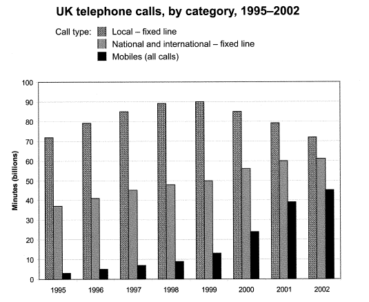
The given bar chart illustrates the total amount of time in billions of telephone calls in the UK of three different categories between 1995 and 2002.
Overall it is clear that the local-fixed line by far the most popular category compared to others in question. Also, both national and international fixed-line and mobiles did experience an increase over the eight-year period.
Looking at the graph more closely, one can see that there were significant changes in the time spent on the local-fixed line. This figure ascended gradually in the first four years, reaching the highest point of 90 billion minutes in 1999. However, the total minutes of local-fixed lines went down by the end of the period, which was roughly equal to what it was in 1995.
Follow by, the overall number of minutes that the British spent for national and international – fixed-line shows the gradually increased, which gained almost five more billion minutes every one year. Besides, the amount of time spent on mobile calls was approximately five times higher by the last year. Therefore, the gap between it and others had narrowed over the period in question.
Top answer
Please read my advice for Task 1 essays: IELTS TASK 1: Hints, Tips And Advice Vocabulary Words For Task 1: Reference Post
- Please read my advice for Task 1 essays: IELTS TASK 1: Hints, Tips And Advice Vocabulary Words For Task 1: Reference Post
Get the Weekly English Kit 📬
New words, one handy idiom, and a 2-minute quiz — delivered to your inbox to keep your streak alive.
The given (Unnatural. Do not use "given", "provided" or other past participles. ) bar chart illustrates (wrong verb. Read my advice) the total amount of time in billions of telephone calls (incorrect expression) in the UK of three
Overall it is clear that (Delete) the local-fixed line by far the most popular (wrong word. Popular means that people like it.) category compared to others in question. (The reader is confused. You have not named the others. Poor cohesion and coherence) Also,
Sample essay:
You will get a lot of extra points for doing simple arithmetic, rather than just copying numbers from the chart.
Paragraph 1: Describe the figure. Tell the reader about the different categories to improve coherence and cohesion to the next paragraphs.
Paragraph 2: Point out two or three significant points without going into details. Note I hav
 Related Questions