
Can everyone help me with my testtt:((? And give me a score, as well?
The bar chart illustrates the level of air pollution by showing the average daily minimum and maximum points of SO2 and N2O in 4 cities namely Los Angeles, Calcutta, Beijing, and Mexico City in the year 2000.
Looking at 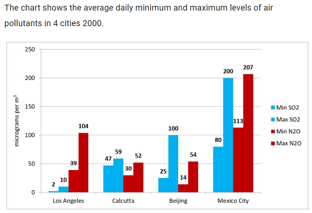
the chart, it is immediately obvious that the amount of SO2 and N2O in Mexico City registered the highest figure and there were many differences between the fours.
In Los Angeles, the average daily levels of SO2 stood at the lowest point (2 micrograms per m3 were minimum and 10 were maximum) while the amount of this figure in Mexico City was up to a higher level, 200 micrograms per m3. The quantity in Calcutta did not change over time since there was a little difference between the minimum level and the maximum level. Besides that, the highest number of SO2 amounts was four times as high as the lowest one.
Different from SO2, the number of pollutants caused by N2O in Los Angeles was much higher, and it was also the second-highest of the fours. The level of N2O emissions in Mexico City was the highest with the daily minimum and maximum averages of 113 and 207 micrograms per m3. A similar trend was witnessed in Calcutta and Beijing, which were polluted by over 50 micrograms of N2O per m3 in maximum.
Top answer
) cities namely Los Angeles, Calcutta, Beijing, and Mexico City in the year 2000. Looking at the chart, it is immediately obvious that (These words are unnecessary. Delete them.
- ) cities namely Los Angeles, Calcutta, Beijing, and Mexico City in the year 2000.
- Looking at the chart, it is immediately obvious that (These words are unnecessary.
- Delete them.
- ) the amount (wrong form.
- ) of SO2 and N2O in Mexico City registered the highest values figure (wrong word) and there were many differences between the fours .
Get the Weekly English Kit 📬
New words, one handy idiom, and a 2-minute quiz — delivered to your inbox to keep your streak alive.
The bar chart illustrates (wrong word) plots the level of air pollution by showing (Just report what is on the bar chart.) the average daily minimum and maximum levels points of two pollutants, SO2 and N2O, in
 Related Questions