
Bar chart - Transport Modes in a European city
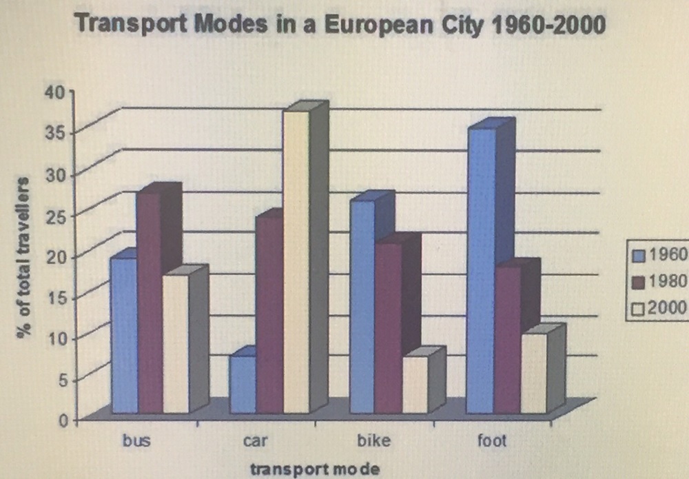
The following bar chart shows the different modes of transport used to travel to and from work in one European city in 1960, 1980, and 2000.
The bar chart compares the percentage of travellers commuted to work by using various kinds of transport in a European city in three different years between 1960 and 2000.
Overall, there was a considerable decline in the proportion of commuters travelled by bikes and on foot, while the percentage of people who used cars rose dramatically and the figures for bus users fluctuated throughout the period.
In 1960, almost 35% of commuters travelled on foot. The figures for those who used bikes and buses were significantly lower, at around 25% and 18% respectively. By contrast, Cars had by far the least common choice with only about 5%. 20 years later, the percentage of bus users witnessed an increase to reach a peak of over 25%, was slightly higher than those travelled by cars, at around 23%. However, there was a gradual reduction in the rate of travellers who walked on foot and used bikes over the period.
By 2000, over 35% people in this city commuted to work by cars, overtaking the figures for bus users, at about 26%. In the same year, about 9% of individuals commuted on foot, compared to the rate of people travelling by bikes stood at just over 5%.
Thank you for your help!
Get the Weekly English Kit 📬
New words, one handy idiom, and a 2-minute quiz — delivered to your inbox to keep your streak alive.
 Related Questions