
Average household
The two pie charts compare the average percentages of household consumption in a nation in 1950 and 2010, a period of sixty years.
It is clear from the two pie charts that housing and food was the most necessary for household used in their life. Both the numbers of them were very high.
In 1950, the figure for housing was the highest, which made up nearly three quarters of the area of chart, at 72,1 percents. While, amount of food was used in a country, which accounted for 11,2 percents of the total. The rate of education was just 6,6 percents but it almost doubled the proportion of transportation. Peopla did not take care of themselves too much so the use of health care was by far lowest in both years, at 2,4% and 4,5% respectively.
In sharp contrast, Food was used more and more in 2005, it increased drastically, approximately to 34%. Surprisingly, the numbers of housing decreased sharply, at 22%, which was significantly less than a half of the figure in 1950. Meanwhile, there were rapid went up in the figure for transportation and other to 14% and 19,2% respectively. Finally, education’s figure insignificantly fell by 0,3% to 6,3%.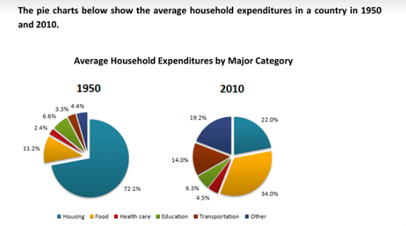
Top answer
First off, you need to break the long paragraph into shorter paragraphs. This will make it easier to read and help the reader focus. ] Beginning in 1950 [ This section is about 1950, not the categories of housing and food, so start there] , we see It is clear from the two pie charts that housing and food was were the categories showing the highest consumption.
- First off, you need to break the long paragraph into shorter paragraphs.
- This will make it easier to read and help the reader focus.
- ] Beginning in 1950 [ This section is about 1950, not the categories of housing and food, so start there] , we see It is clear from the two pie charts that housing and food was were the categories showing the highest consumption.
- most necessary for household used in their life.
- Both the numbers of them were very high.
Get the Weekly English Kit 📬
New words, one handy idiom, and a 2-minute quiz — delivered to your inbox to keep your streak alive.
First off, you need to break the long paragraph into shorter paragraphs. This will make it easier to read and help the reader focus. Here are my other suggestions [with notes]:
The two pie charts compare the average percentages of household consumption expenditures in six categories of goods in a nation in 1950 and 2010, a period of sixty yea
 Related Questions