
Adults
The bar chart shows the percentage of adult who 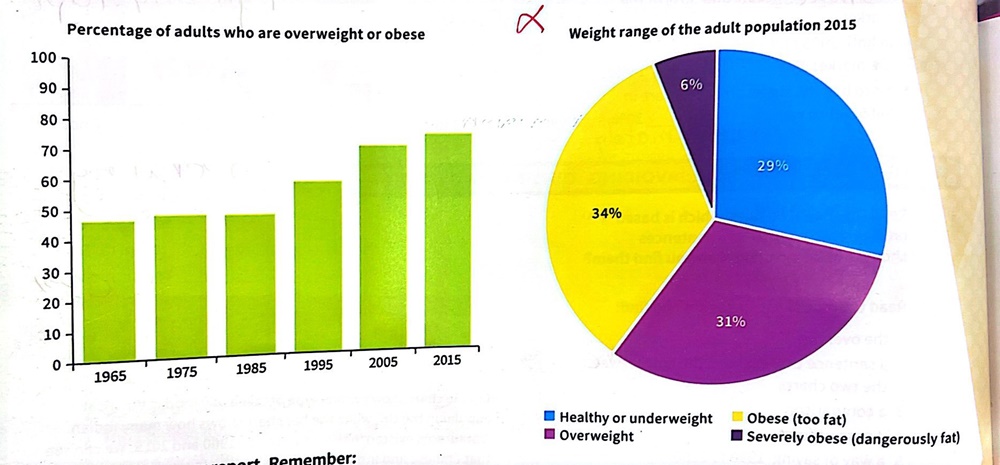
are overweight or obese, while the pie chart shows the weight range of the adult population (Healthy , Overweight , Obese , Severely obese)in 2015. We can see that most of adults are too fat .
The bar chart shows during the 1965 to 1985 there was not much change in the number , it was almost 50% but during the 1985 to 1995 There has been a significant increase about
10% and after that (1995 to 2005) also (2005 to 2015) the trend is increasing that means the percentage of adults who are overweight gets more and more .
The pie chart in 2015 shows about 70% of adults were to heavy , 31% of them are overweight and 34% are obese ,Only 6% of them are severely obese they are in dangerous situation . We can see just 29% of them are underweight .
Top answer
The bar chart [ 1 ] shows tracks the percentage of [ 2 ] adul t s who [ 3 ] are were overweight or obese from 1965 to 2015 , while the pie chart [ 4 ] shows the weight range of the adult population (Health y, [ 5 ] Overweight, Obese, Severely obese) in 2015. We can see that [ 6 ] most of adults are [ 3] were too fat. The bar chart shows during the [ 7 ] From 1965 to 198 5, there was not much change in the number , proportion of overweight people, with the figure hovering around 45%, it was almost 50% but during the between 1985 to and 199 5, T t here [ 8 ] has been was a significant increase , of about 10 %.
- The bar chart [ 1 ] shows tracks the percentage of [ 2 ] adul t s who [ 3 ] are were overweight or obese from 1965 to 2015 , while the pie chart [ 4 ] shows the weight range of the adult population (Health y, [ 5 ] Overweight, Obese, Severely obese) in 2015.
- We can see that [ 6 ] most of adults are [ 3] were too fat.
- The bar chart shows during the [ 7 ] From 1965 to 198 5, there was not much change in the number , proportion of overweight people, with the figure hovering around 45%, it was almost 50% but during the between 1985 to and 199 5, T t here [ 8 ] has been was a significant increase , of about 10 %.
- and after that (1995 to 2005) also (2005 to 2015) the That rising trend continued after that, and the percentage of people whose weight was too high reached an alarming 70% by 2015.
- is increasing that means the percentage of adults who are overweight gets more and more .
Get the Weekly English Kit 📬
New words, one handy idiom, and a 2-minute quiz — delivered to your inbox to keep your streak alive.
The bar chart [ 1] shows tracks the percentage of [ 2] adults who [ 3] are were overweight or obese from 1965 to 2015
 Related Questions