
25/9 WT1 please help me to check this essay
Please help me to check this and correct some errors. Thank you <3
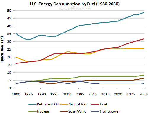
The linegraph illustrates the demand for energy in US in the phase of 50 years from 1980 to 2030.
Overall, the consumption of fuel generally shows an upward trend throught the surveyed period except for hydropower. Petrol and oil was the most popular energy in all of the years shown.
In 1980, the amount of petrol and oil consumed was the highest out of 6 types of fuel at 35 G units. In the next five years, the figure suddenly lost its momentum and bottomed at 31 units before recovering and reaching the peak of 50 G units. Similarly, natural gas demand is expected to increase steadily from 20 units to 25 units in the last year shown despote some fluctuations while coal witnessed a marked growth from 15 G units to the second rank at 27 G units in 2030.
Starting off from 3 G units, Nuclear and solar& wind consumption is predicted to have the same tendency of a slight rise to 8 and 6 G units correspondingly by 2030. Throughout the 50-year period, hydropower is forecastetd to remain constant with the amount of energy use at 3 G units
Top answer
The linegraph illustrates the demand (incorrect word) for energy in US in the phase (wrong word) of 50 years from 1980 to 2030. (You missed giving a lot of information to the reader about this graph. For example: Six types of fuel are shown: Petrol and oil, Also fuel usage is projected for 12 years into the future.
- The linegraph illustrates the demand (incorrect word) for energy in US in the phase (wrong word) of 50 years from 1980 to 2030.
- (You missed giving a lot of information to the reader about this graph.
- For example: Six types of fuel are shown: Petrol and oil, Also fuel usage is projected for 12 years into the future.
- The units on the Y axis are quadrillion (Q) units.
- ) Overall, the consumption of fuel generally shows an upward trend throught the surveyed (incorrect word.
Get the Weekly English Kit 📬
New words, one handy idiom, and a 2-minute quiz — delivered to your inbox to keep your streak alive.
The linegraph illustrates the demand (incorrect word) for energy in US in the phase (wrong word) of 50 years from 1980 to 2030. (You missed giving a lot of information to the reader about this graph. For example: Six types of fuel are sho
 Related Questions